
Sanel Selimovic
In early 2019, Funding Circle embarked on an ambitious project to enhance their mobile presence through the launch of a new Android app and the harmonization of their iOS app's design language to mirror Android's advancements. My role, in collaboration with Product leadership over a span of five months, was pivotal in redefining the investor onboarding experience for the Android platform. Through extensive research and iterative design, we succeeded in creating a cohesive user experience across mobile interfaces, culminating in a significant fivefold increase in investor deposits.
Project Date
2019-2020
Project Type
Android App
Client
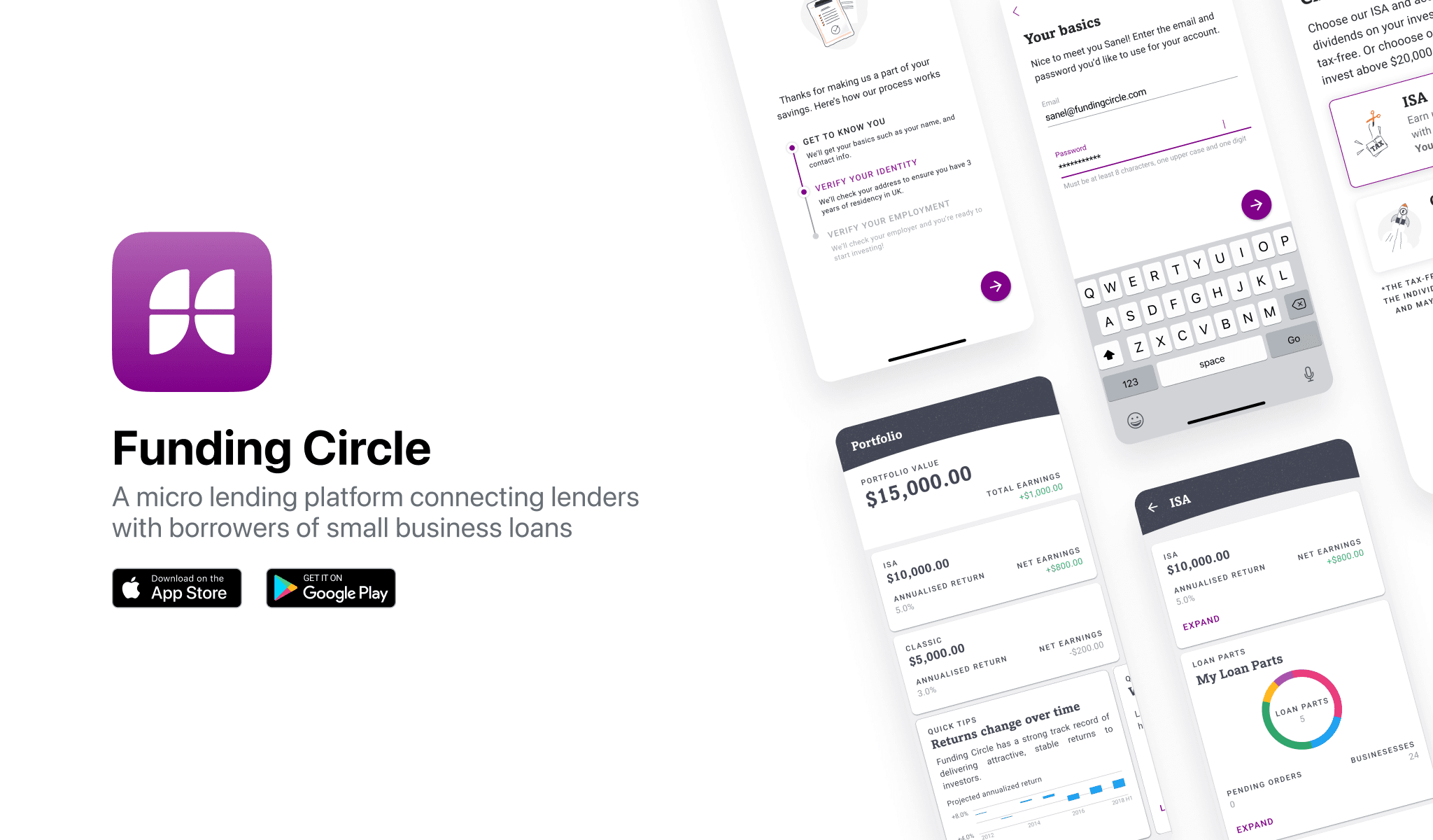
Funding Circle
As the Lead Product Designer for both iOS and Android platforms, my responsibilities were comprehensive, encompassing user research, ideation, and the alignment of product visions with stakeholder expectations. I led the creation of user flows and visual designs, developed interactive prototypes, and iteratively refined our designs based on user feedback. My efforts were central to translating research insights into actionable design strategies that enhanced user engagement and facilitated goal achievement.

Lender Interface: Design an easy-to-use dashboard for lenders to track their investments, earnings, and diversify their lending portfolio effortlessly.

Risk Assessment: Design tools that help lenders assess the risk associated with lending to specific businesses or individuals.

User Trust: Develop a design that fosters trust among users, highlighting transparent borrower profiles and detailed information on lending opportunities.
Funding Circle, a leading peer-to-peer lending marketplace, aimed to bolster investor acquisition by enhancing the mobile user experience. The challenge was multifaceted: aligning the visual and functional design across iOS and Android platforms, which had diverged significantly over time, and establishing a robust design framework to support A/B testing and future optimizations.
The Android app, being newer, offered limited functionality, while the iOS app, despite its comprehensive features, required a modernized design overhaul. Our mission was to reconcile these disparities and elevate the mobile experience to drive investor engagement.

User Testing

Design Handoff

Customer Interviews

Design System

UI & UX Design

Interactive Prototyping
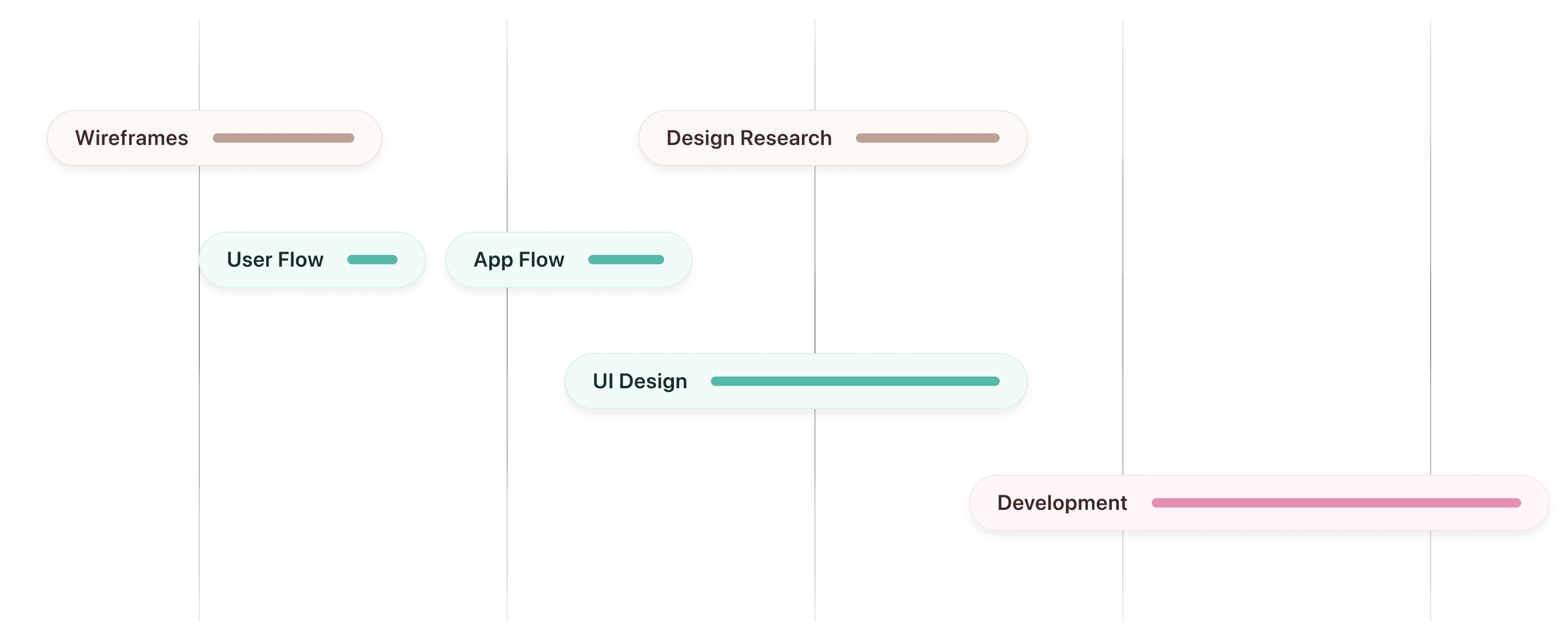
This figure presents an overview of the project's lifecycle, illustrating the phased approach from initial market research through to the development stage. It encapsulates the meticulous process undertaken to ensure that each step, from wireframing to UI design and the establishment of a style guide.
The project was driven by strategic business objectives: to escalate customer acquisition by increasing the conversion rate of visitors to investors, to gather enhanced data for personalizing user experiences, and to lay the groundwork for ongoing A/B testing and optimization. Specific goals included boosting iOS sign-ups from 350 to 450 per week and augmenting monthly contributions beyond £700k. Achieving these objectives required a focused, user-centered design approach that addressed the unique needs and expectations of Funding Circle’s diverse user base.

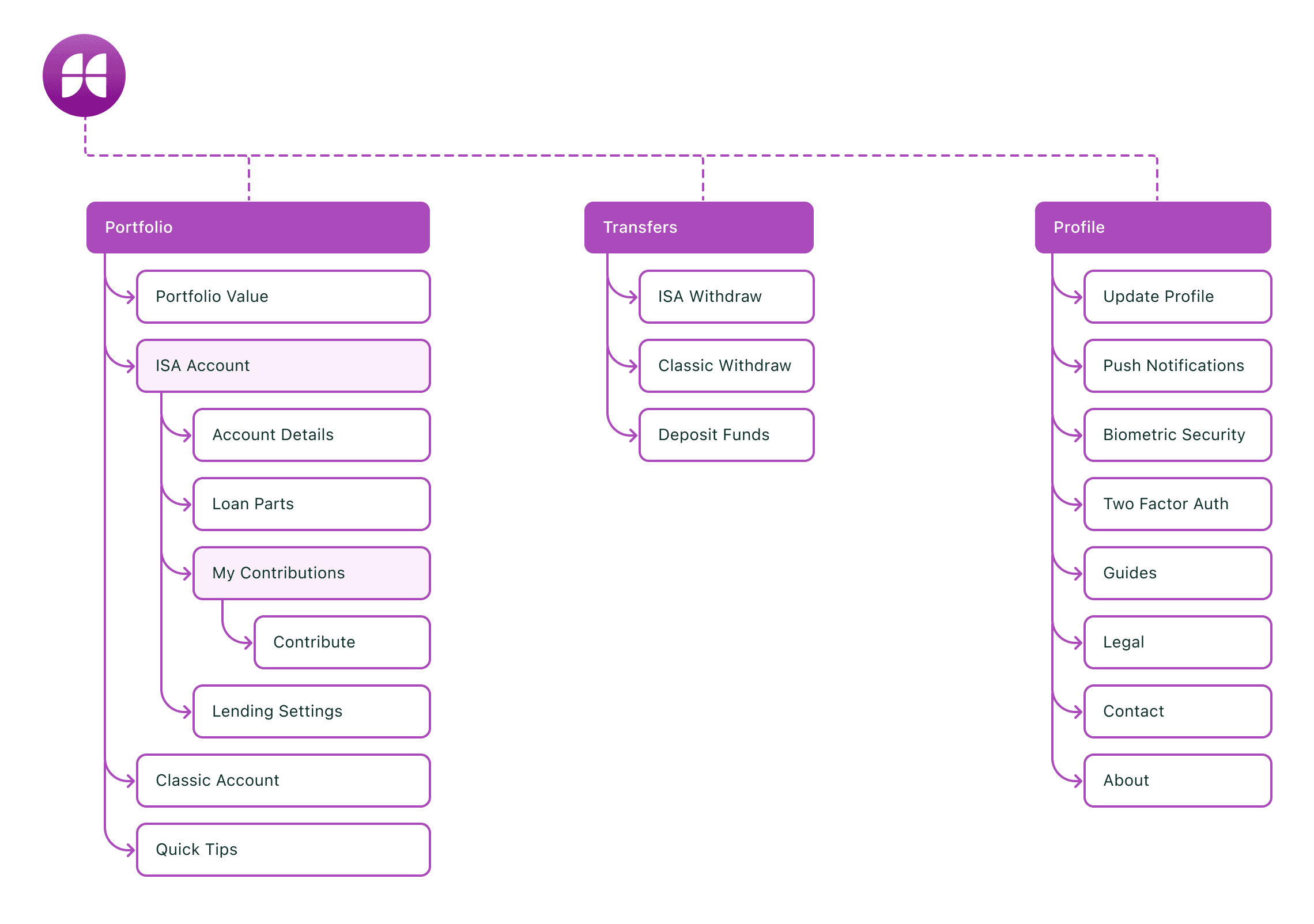
The creation of the Information Architecture (IA) was a foundational step in the design process for Funding Circle, serving as a strategic blueprint that guided our design thinking. By mapping out the app's structure, we were able to visualize and plan the user journey, ensuring a seamless and intuitive navigation experience.
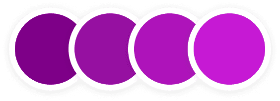
Royal Purple
We used royal purple, commonly linked with regality and refinement, to evoke trust within our clientele. This choice lends the application a sophisticated design tailored to appeal to high net worth investors.
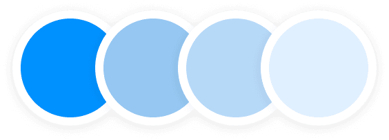
Cobalt Blue
Blue is favored in design for its trustworthiness. Light shades offer calm backgrounds, while deeper blues denote professionalism.

Through semi-structured interviews with six users across our iOS and Android platforms, we gained invaluable insights into the investing experience and the challenges users faced. These discussions, conducted in partnership with the product manager, allowed us to pinpoint and scrutinize specific problem areas.
Our findings highlighted a crucial user concern: the iOS application, originally optimized for the smaller iPhone 5 series, appeared outdated and failed to utilize the screen real estate of newer, larger models like the iPhone 10 and 11. This insight was particularly revealing, as the iOS app had not undergone a significant visual update since its adaptation for the iPhone 6 in 2015, signaling a clear need for a design overhaul to align with modern device standards.
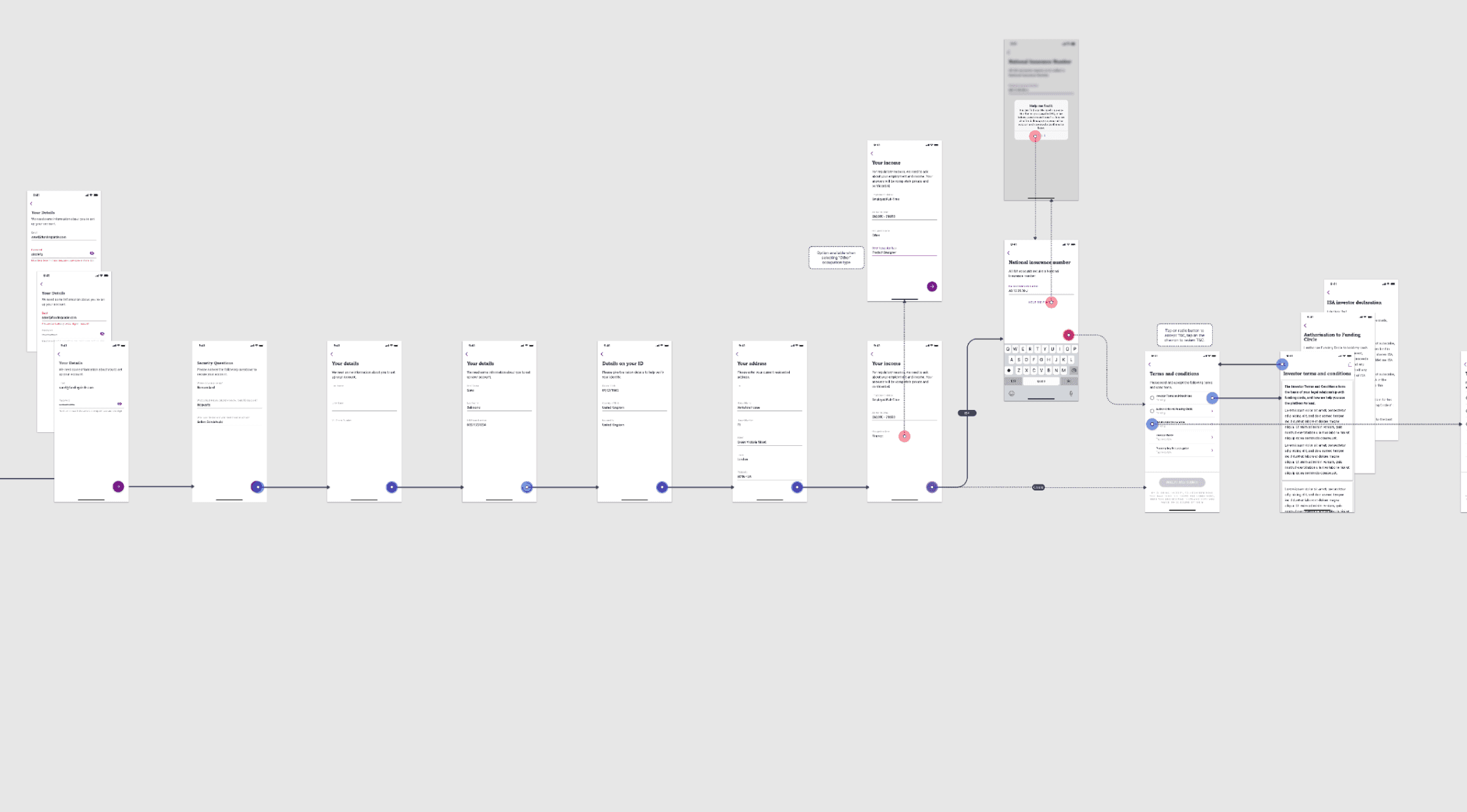
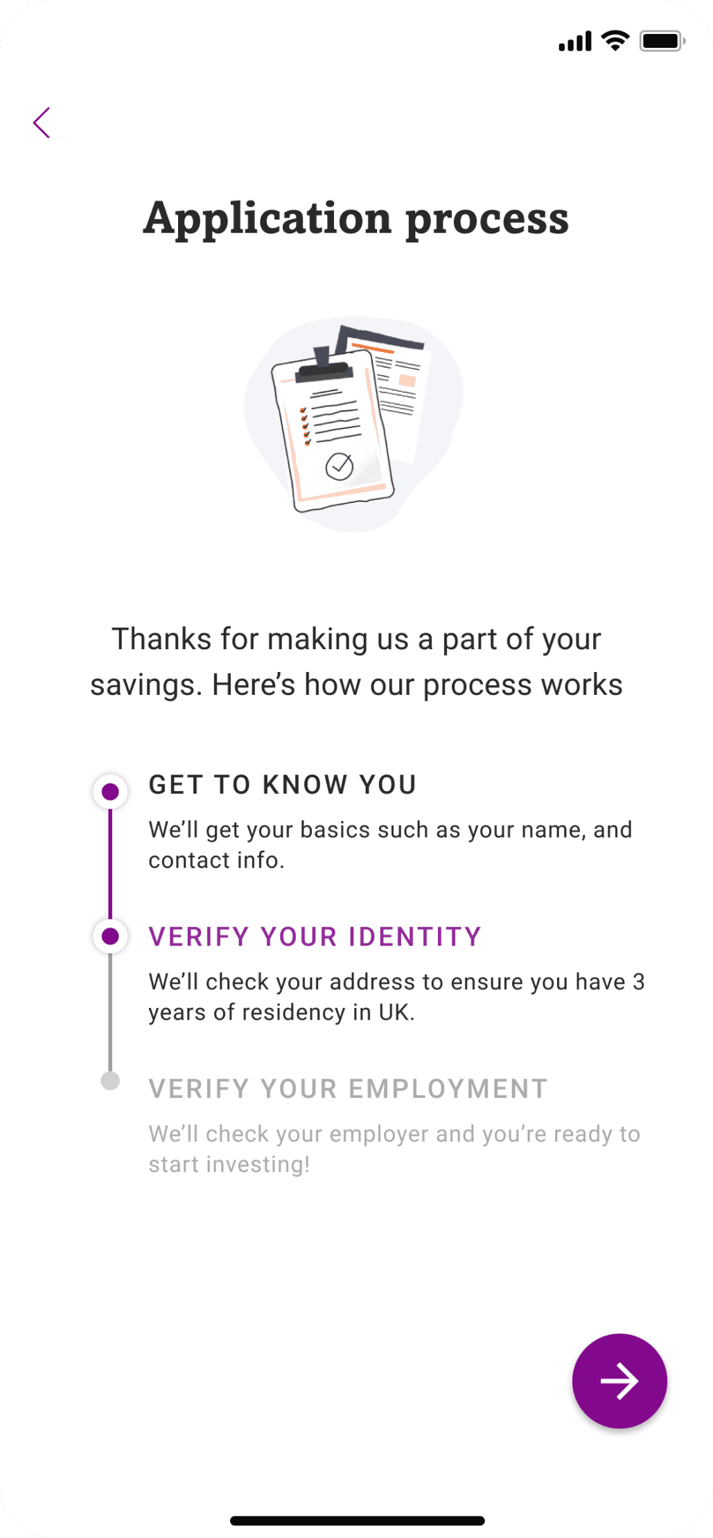
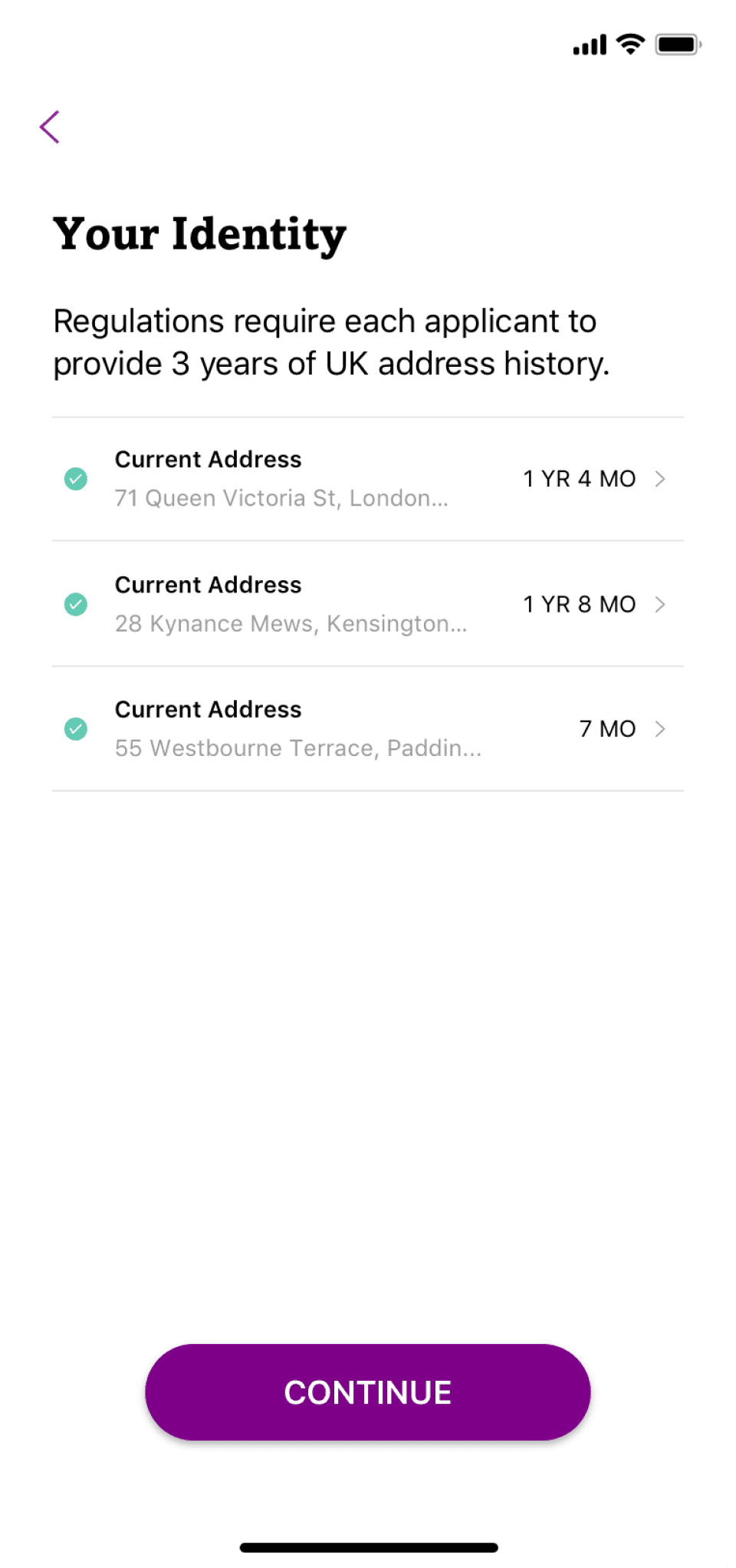
The onboarding process underwent a meticulous evaluation, starting with a comprehensive review of the existing web user onboarding experience. Collaborating closely with the Product Manager, Ben, and the Head of Product, Ira, we identified and addressed several inefficiencies in the onboarding questionnaire. After a thorough validation with the compliance team, we determined that certain data points, previously deemed essential, were in fact superfluous for assessing investor eligibility.
This led to the elimination of redundant questions about address history and employment details, which the risk assessment team found unnecessary. Furthermore, we streamlined the onboarding experience by replacing obsolete security questions with more user-friendly biometric verification methods, such as Face ID for iOS and One Touch for Android, thereby enhancing both security and user convenience.
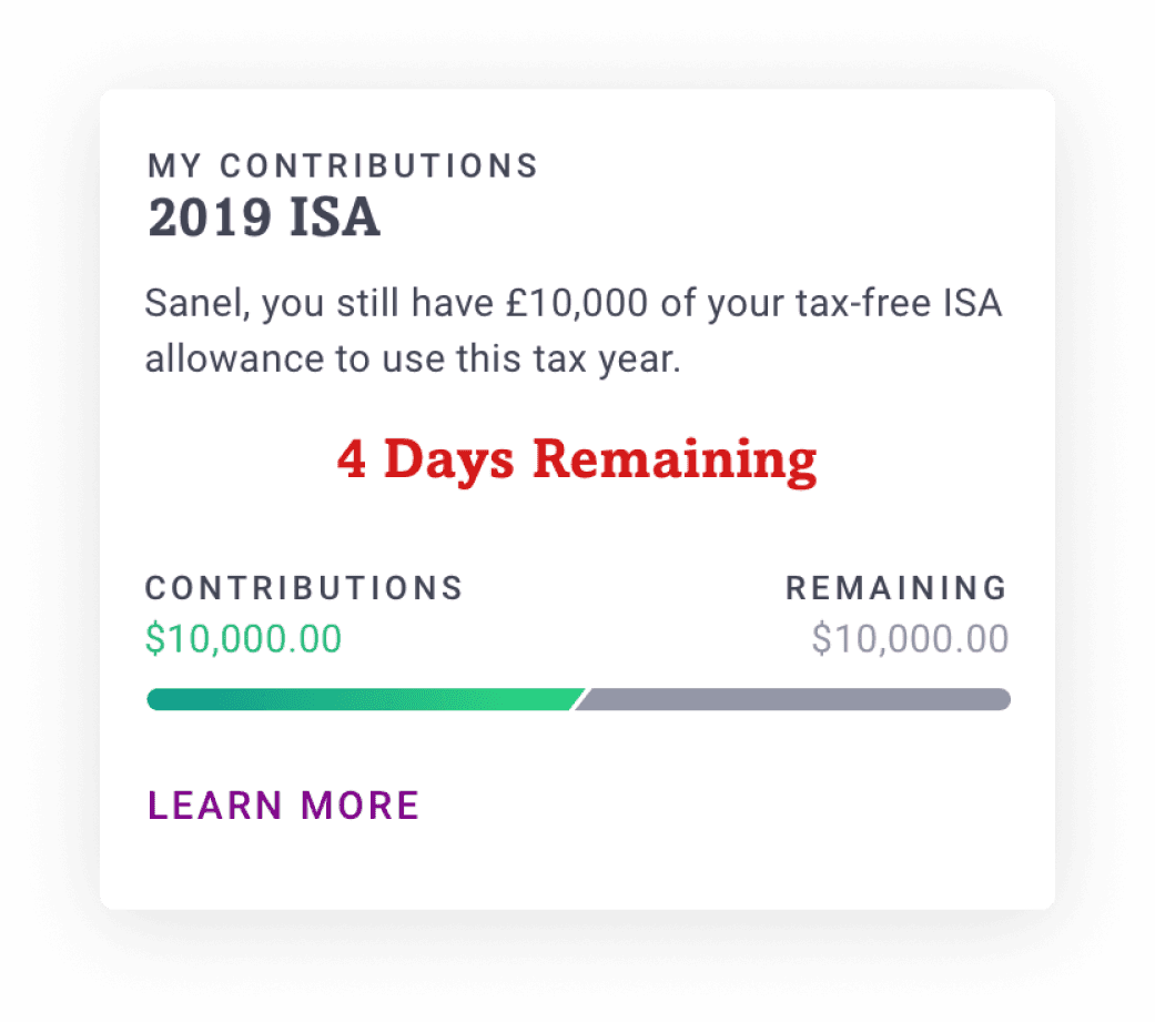
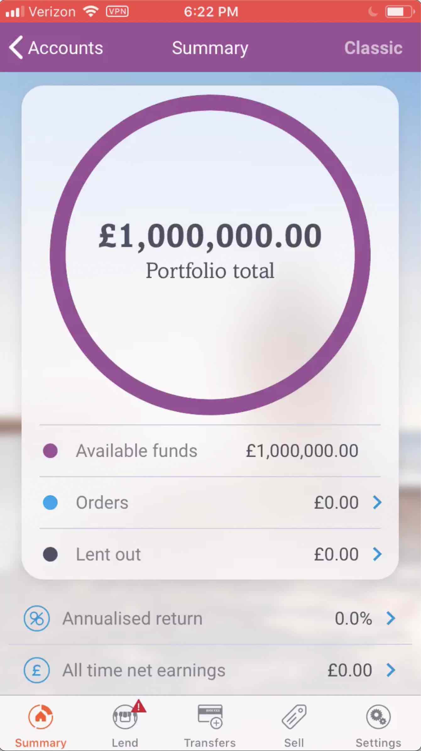
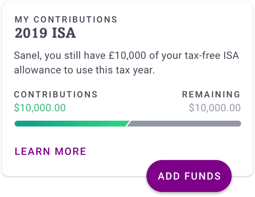
In a strategic effort to refine the onboarding experience, significant enhancements were introduced to the "Add Funds" flow, aimed at simplifying and incentivizing new investments. A key innovation was the integration of a countdown timer on the Invest card, designed to create a sense of urgency by highlighting the impending tax deadline—a tactic supported by research indicating potential boosts in conversion rates by up to 300%.
This urgency, combined with the clarity of a prominent "Add Funds" call-to-action (CTA), formed a potent conversion tool. These adjustments not only aligned with our business objectives of increasing contributions but also led to a notable 21% year-over-year increase in contributions within the first month, amassing over £2.5 million.
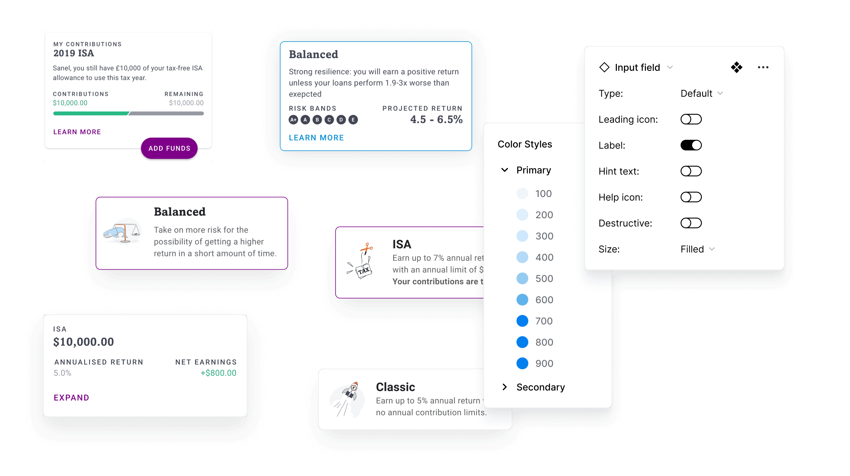
This visual showcase features key elements like buttons, input fields, and information cards, each meticulously designed to enhance usability and maintain brand consistency across the platform.

The project yielded profound insights into customer behavior and preferences through rigorous user testing, revealing diverse priorities and approaches to achieving financial goals among our customers. The introduction of the "Add Funds" CTA as part of the investment card catalyzed a significant immediate impact, with deposits exceeding £600,000 in the initial four days and reaching £2.5 million within the first month.
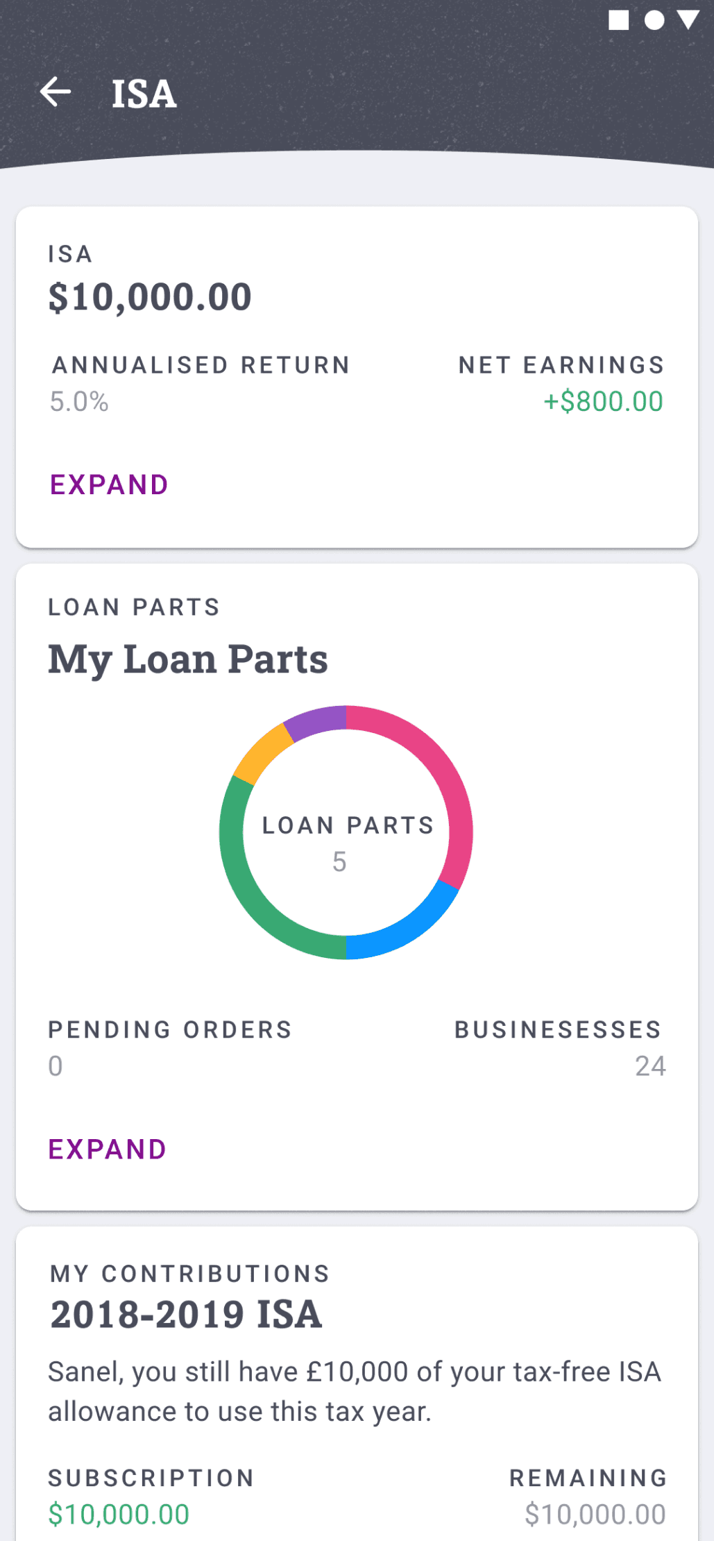
The refinement of the onboarding flow was instrumental in increasing both the success rate of account openings and the volume of deposits, ultimately resulting in a fourfold increase in opened accounts and a threefold surge in deposits, from £1.3 million to £3.9 million. This achievement underscores the effectiveness of our user-centered design enhancements and strategic optimizations.
Brian Manning
Executive Director of Design
Sanel displayed a high degree of integrity, responsibility, and adaptability while working on several complex projects. He has an analytical mind and is a problem solver by nature. Our products have steep learning curves and Sanel’s technical dexterity enabled him to quickly ramp up on 3 of them and provide meaningful contributions to ongoing projects.
© 2026 Sanel Selimovic
¿Why is a raven like a writing desk?